I was recently given a home assignment to build a model explaining the fuel economy for vehicles of all models and years using the data collected by the EPA. The requirement was for the notebook to be a self-contained file with code and outputs and a hiring manager was the audience. It took me more than the expected 3-4 hours, but I answered questions such as how has the fuel economy changed over time, which manufacturer produces the most fuel efficient cars and what variables have an effect on city mpg (variable “UCity”). The process is organized as follows:
- Understand the distribution of the dependent variable
- Exploratory data analysis of categorical, numeric variables and over time.
- Fit a Generalized Linear Model of Binomial and Gamma families aand test different link functions.
The car fuel data can be found here. The data dictionary is here.
import numpy as np
import pandas as pd
pd.set_option('display.max_columns', None)
import matplotlib.pyplot as plt
import seaborn as sns
sns.set_style('white')
from empiricaldist import Pmf

df= pd.read_csv("vehicles.csv", parse_dates=['createdOn','modifiedOn'])
# since I'm parsing dates, I'm going to modify (simplify) them right here and then delete the original
df['monthyear_created'] = df['createdOn'].dt.to_period('M')
df['monthyear_modified'] = df['modifiedOn'].dt.to_period('M')
df.drop(['createdOn','modifiedOn'], axis='columns', inplace=True)
0. How is the data organized? What is the unit of observation?
# Get a series object containing the count of unique elements in each column of dataframe
df.nunique().sort_values(ascending=False)
    id             40081
    UHighway        7417
    UCity           7184
    comb08U         5262
    model           3960
                   ...
    phevBlended        2
    mpgData            2
    sCharger           1
    tCharger           1
    charge120          1
    Length: 83, dtype: int64
To understand how the data is organized, I look at the column that has the most unique values. Vehicle record id has as many unique values as the dataset has rows. So that’s the unit of observation.
The dataset is pretty neat on the first look, there are only about 10 columns (out of 82) that have few non-null values and can be dropped.
1. Examine (Clean, validate, visualize) the target variable.
MPG is a continuous variable. It doesn’t have missing data, but we still need to validate it by looking at value counts, as well as the describe method, to check if there are some abnormal quantities.
# first quick look
df['UCity'].value_counts().sort_index()
    0.0000      25
    7.0000       5
    8.0000       4
    8.4473       1
    8.8889       4
                ..
    188.4087     2
    195.0000     1
    196.4000     4
    197.5771     1
    224.8000     3
    Name: UCity, Length: 7184, dtype: int64
0 mpg is an invalid value for mpg, so we get rid of those rows.
df=df.loc[df['UCity'] != 0.0000]
# first quick look at the response variable's distribution
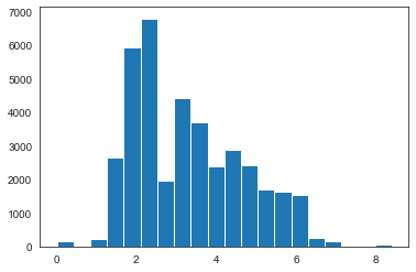
plt.hist(df['UCity'], bins=50);
plt.xlabel('mpg')
plt.ylabel('count')
plt.show()
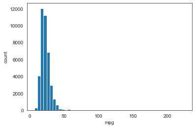
After trying different bin sizes to see how MPG in UCity variable is distributed, 50 bins seems like a balanced number: enough nuance yet still simple to grasp. We can see that MPG is not normally distributed as the shape is not symmetrical: the right tail is much longer than the left. This violates the assumptions of linear modelling and prevents us from using models that make the linearity assumption.
We can get a better view of MPG distribution with a probability distribution. Since it’s a continuos variable with relatively small number of values, we’ll use a Probability Density Function, as well as Cumulative Distribution Function.
def ecdf(data):
    """Compute ECDF for a one-dimensional array of measurements."""
    # Number of data points: n
    n = len(data)
    # x-data for the ECDF: x
    x = np.sort(data)
    # y-data for the ECDF: y
    y = np.arange(1, n+1) / n
    return x, y

# Compute mean and standard deviation: mu, sigma
mu = np.mean(df['UCity'])
sigma = np.std(df['UCity'])
# Sample out of a normal distribution with this mu and sigma: samples
samples = np.random.normal(mu, sigma, size = 10000)

# Compute observed and theoretical CDF
x, y = ecdf(df['UCity'])
x_theor, y_theor = ecdf(samples)

# Generate them
plt.plot(x, y, marker='.', linestyle ='none', ms=0.5, label='observed')
plt.plot(x_theor, y_theor, color='orange', lw=2, label='theoretical')

# Specify array of percentiles: percentiles
percentiles = np.array([2.5, 25, 50, 75, 97.5])
# Compute mpg percentiles
percentiles_mpg = np.percentile(df['UCity'], percentiles)
# Overlay percentiles as red diamonds.
plt.plot(percentiles_mpg, percentiles/100, marker='D', ms=4, color='darkblue', linestyle='none', label='percentiles')
sns.despine()
# Label the axes
plt.xlabel('MPG')
plt.ylabel('ECDF')
plt.title('Checking if MPG is normally distributed')
plt.legend()
# Display the plot
plt.show()
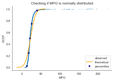
1. The overwhelming majority (97.5%) of observations are less than 50 MPG.
2. The theoretical CDF sampled from the normal distribution and empirical CDF of the observed data are not tightly close to each other, and so MPG is not normally distributed.
# subset the df by high MPG
is_high=df.loc[df['UCity']>=50]
not_high=df.loc[df['UCity']<50]
is_very_high=df.loc[df['UCity']>=100]

# Compute ECDF
x_high, y_high = ecdf(is_high['UCity'])
x_nothigh, y_nothigh = ecdf(not_high['UCity'])

# Generate plot
plt.plot(x_high, y_high, marker='.', color='darkgreen',
         linestyle ='none', label='observed: cars with mpg > 50')
plt.plot(x_nothigh, y_nothigh, marker='.', color='crimson',
         linestyle ='none', label='observed: cars with mpg < 50')
plt.plot(x_theor, y_theor, color='darkorange', label='theoretical')

# Label the axes
_ = plt.xlabel('MPG')
_ = plt.ylabel('ECDF')
plt.legend()
plt.show()
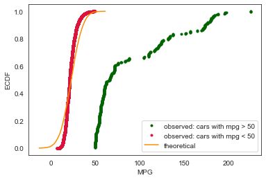
We will later see that the arrival of electronic cars introduced entirely different posssibilities for fuel efficiency. Therefore the problem might be better approached as a binary classification first and then as two separate regressions.
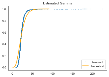
To understand better how the dependent variable is distributed, we’ll test the gamma distribution (a two-parameter family of continuous probability distributions).
def calculateGammaParams(data):
    mean = np.mean(data)
    std = np.std(data)
    shape = (mean/std)**2
    scale = (std**2)/mean
    return (shape, 0, scale)

from scipy.stats import gamma
eshape, eloc, escale = calculateGammaParams(df['UCity'])

# Sample out of a gamma distribution
samples_gamma = np.random.gamma(eshape, escale, size = 10000)

# Compute observed and theoretical CDF
x, y = ecdf(df['UCity'])
x_gamma, y_gamma = ecdf(samples_gamma)

# Plot them
plt.plot(x, y, marker='.', linestyle ='none', ms=0.5, label='observed')
plt.plot(x_gamma, y_gamma, color='orange', lw=2, label='theoretical')
plt.title('Estimated Gamma')
sns.despine()
plt.legend()
plt.show()
# Using the python library for fitting
shape, loc, scale = gamma.fit(df['UCity'], floc=0)
# print(shape, loc, scale) #what are these for?

# Sample out of a gamma distribution
samples_gamma = np.random.gamma(shape, scale, size = 10000)
x_gamma, y_gamma = ecdf(samples_gamma)

plt.plot(x, y, marker='.', linestyle ='none', ms=5, label='observed')
plt.plot(x_gamma, y_gamma, color='orange', lw=2, label='theoretical')
plt.title('Fitted Gamma')
plt.legend()
plt.show()
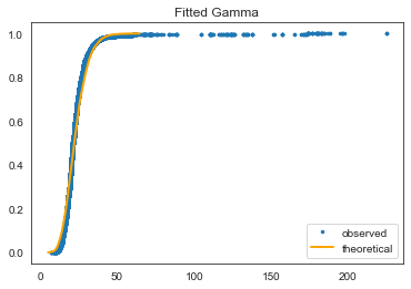
This is a much better fit. Could probably be better without outliers.
2.a. Categorical
In this section, we’re looking at:
-
What are the biggest categories among the 22 categorical features in the dataset?
-
How fuel efficient are different categories?
cat_df = df.select_dtypes(exclude=[np.number])
# cat_df.info()
cat_df.nunique().sort_values(ascending=False)\
        .rename('Count').to_frame()
| Count | |
|---|---|
| model | 3950 |
| eng_dscr | 550 |
| rangeA | 220 |
| evMotor | 140 |
| make | 135 |
| monthyear_created | 59 |
| trans_dscr | 52 |
| mfrCode | 47 |
| monthyear_modified | 40 |
| trany | 37 |
| VClass | 34 |
| fuelType | 13 |
| drive | 8 |
| atvType | 7 |
| fuelType1 | 6 |
| c240Dscr | 5 |
| c240bDscr | 4 |
| fuelType2 | 3 |
| guzzler | 3 |
| phevBlended | 2 |
| mpgData | 2 |
| startStop | 2 |
| sCharger | 1 |
| tCharger | 1 |
(cat_df.isnull().sum()/len(cat_df)*100).sort_values(ascending=False)[:15]
    c240bDscr     99.842720
    c240Dscr      99.837727
    evMotor       98.162572
    sCharger      98.012782
    rangeA        96.195327
    fuelType2     96.182844
    guzzler       94.065808
    atvType       91.636709
    tCharger      84.267026
    startStop     79.086779
    mfrCode       76.874875
    trans_dscr    62.460056
    eng_dscr      39.634512
    drive          2.968344
    trany          0.027462
    dtype: float64
Dropping all the columns where there is more than half missing values, as well as redundant and id- or record-related features that by nature don’t have a causal effect on fuel efficiency:
missing=['c240bDscr', 'c240Dscr', 'evMotor', 'sCharger',
         'rangeA', 'guzzler', 'atvType', 'tCharger',
         'startStop', 'mfrCode', 'trans_dscr', 'fuelType2']
record=['monthyear_created','monthyear_modified']
redundant=['fuelType1']

df.drop(missing, axis='columns', inplace=True)
df.drop(record, axis='columns', inplace=True)
df.drop(redundant, axis='columns', inplace=True)
ENGINE DESCRIPTOR
df['eng_dscr'].value_counts()

    (FFS)                                8827
    SIDI                                 4902
    (FFS) CA model                        926
    (FFS)      (MPFI)                     734
    FFV                                   683
                                         ...
    (350 V8) (GUZZLER) (POLICE) (FFS)       1
    Cabrio model                            1
    4.6M FFS MPFI                           1
    MAZDA6 T/C                              1
    B308I4 (FFS) (VARIABLE)                 1
    Name: eng_dscr, Length: 550, dtype: int64
Looks messy and too daunting to understand or categorize 550 unique values into smaller groups. Plus, 39% of values are missing, so will drop.
df.drop(['eng_dscr'], axis='columns', inplace=True)
FUEL TYPE
# biggest cateogories
df['fuelType'].value_counts(normalize=True)[:10]

    Regular                        0.648991
    Premium                        0.276288
    Gasoline or E85                0.032080
    Diesel                         0.028510
    Electricity                    0.004194
    Premium or E85                 0.003121
    Midgrade                       0.002497
    CNG                            0.001348
    Premium and Electricity        0.001173
    Regular Gas and Electricity    0.000724
    Name: fuelType, dtype: float64
# average mpg per cateogory
df.groupby('fuelType')['UCity'].mean().sort_values(ascending=False)

    fuelType
    Electricity                    140.504819
    Regular Gas and Electricity     59.131841
    Regular Gas or Electricity      58.700000
    Premium Gas or Electricity      37.437446
    Premium and Electricity         33.411545
    Diesel                          27.755046
    Regular                         22.868272
    Premium or E85                  21.824383
    Premium                         21.337866
    CNG                             20.801989
    Gasoline or natural gas         19.669675
    Gasoline or E85                 19.242580
    Midgrade                        18.789633
    Name: UCity, dtype: float64
plt.figure(figsize=(20, 8))
# Make a box plot
sns.boxplot(x='fuelType', y='UCity', data=df)
# Remove unneeded lines and label axes
sns.despine(left=True, bottom=True)
plt.xlabel('fuel type')
plt.ylabel('mpg')
plt.show()
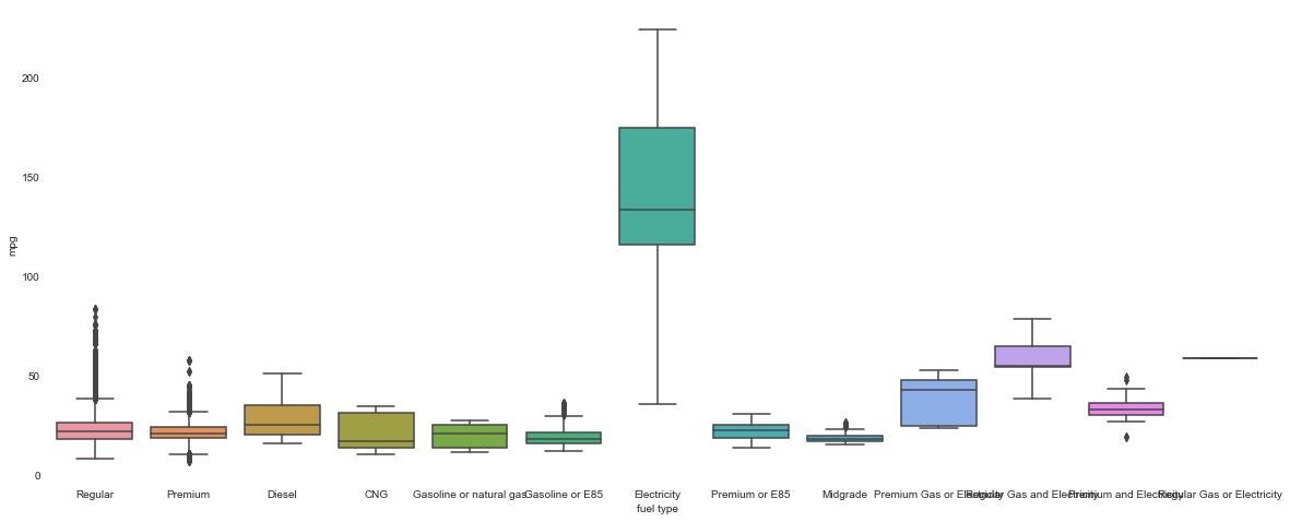
There is a clear winner among the fuel types! Electricity fuel type is on another level of fuel economy, we will use this to separate the dataset into 2 groups, electric and not.
# making 2 separate datasets
electric_df = df.loc[df['fuelType']=='Electricity']
nonelectric_df = df.loc[df['fuelType']!='Electricity']

# encoding a binary variable
df['electric']=0
df.loc[df['fuelType']=='Electricity', 'electric']=1
print(df['electric'].value_counts())

print(df.groupby('electric')['UCity'].median())

    0    38706
    1      160
    Name: electric, dtype: int64
    electric
    0     21.1111
    1    134.2635
    Name: UCity, dtype: float64
Fuel type (being electric or not) helps us break the problem into 2 parts: first separate to vehicles into electric or not, then model fuel efficiency for the two groups separately.
DRIVE
df['drive'].value_counts()

    Front-Wheel Drive             13937
    Rear-Wheel Drive              13522
    4-Wheel or All-Wheel Drive     6642
    All-Wheel Drive                2713
    4-Wheel Drive                  1328
    2-Wheel Drive                   507
    Part-time 4-Wheel Drive         217
    Automatic (A1)                    1
    Name: drive, dtype: int64
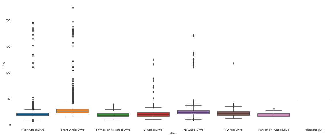
plt.figure(figsize=(20, 8))
# Make a box plot
sns.boxplot(x='drive', y='UCity', data=df)
# Remove unneeded lines and label axes
sns.despine(left=True, bottom=True)
plt.xlabel('drive')
plt.ylabel('mpg')
plt.show()
df.loc[df['drive'].isnull()].head()
# hard to detect a missing value pattern here, so will just drop missing rows
df.dropna(subset=['drive'], inplace=True)

# also the single observation of automatic vehicle has to go,
#even though it's the most fuel efficient one
df=df.loc[df['drive']!='Automatic (A1)']

# Create column subplots based on drive category
g=sns.catplot(x='drive',y='UCity', data=df,
            kind="bar", col="electric")
g.set_xticklabels(rotation=25, horizontalalignment='right')
plt.show()
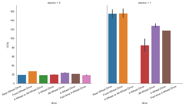
The average fuel efficiency in different types of drive is substantially higher in electric cars.
TRANSMISSION
df['trany'].value_counts()[:5]
    Automatic 4-spd    10764
    Manual 5-spd        7990
    Automatic (S6)      2984
    Automatic 3-spd     2719
    Manual 6-spd        2671
    Name: trany, dtype: int64
# simplify categories
df['transmission'] = np.where(df['trany'].str.contains("Automatic"),1,
                              np.where(df['trany'].str.contains("Manual"),0,
                              df['trany']))

df['transmission'] = df['transmission'].astype(int)

# check
df[['transmission', 'trany']]
df['transmission'].value_counts()

# drop original
df.drop(['trany'], axis='columns', inplace=True)

# see if there's difference in average mpg per different transmission
df.groupby('transmission')['UCity'].mean().sort_values(ascending=False)
    transmission
    0    23.738899
    1    22.553122
    Name: UCity, dtype: float64
# Create a count plot with location subgroups
sns.relplot(x="transmission", y="UCity", hue="electric", data=df, kind="scatter")
plt.show()
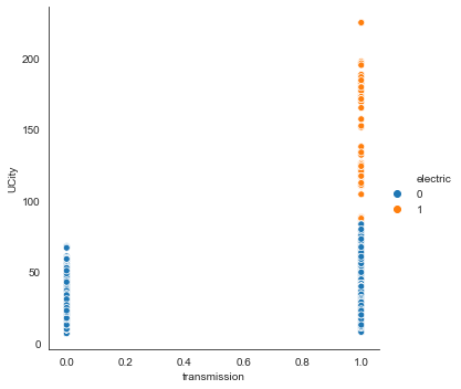
There are no electric cars with manual transmission.
VEHICLE SIZE CLASS
df['VClass'].value_counts(normalize=True)[:10]
    Compact Cars                   0.141615
    Subcompact Cars                0.120028
    Midsize Cars                   0.115268
    Standard Pickup Trucks         0.060567
    Sport Utility Vehicle - 4WD    0.053775
    Large Cars                     0.052051
    Two Seaters                    0.050687
    Sport Utility Vehicle - 2WD    0.041862
    Small Station Wagons           0.037771
    Special Purpose Vehicles       0.037385
    Name: VClass, dtype: float64
small = ['Compact Cars','Subcompact Cars','Two Seaters','Minicompact Cars']
midsize = ['Midsize Cars']
large = ['Large Cars']

df.loc[df['VClass'].isin(small), 'VCat'] = 'Small'
df.loc[df['VClass'].isin(midsize), 'VCat'] = 'Midsize'
df.loc[df['VClass'].isin(large), 'VCat'] = 'Large'
df.loc[df['VClass'].str.contains('Station'), 'VCat'] = 'Station Wagons'
df.loc[df['VClass'].str.contains('Truck'), 'VCat'] = 'Pickup Trucks'
df.loc[df['VClass'].str.contains('Special Purpose'), 'VCat'] = 'Special Purpose'
df.loc[df['VClass'].str.contains('Sport Utility'), 'VCat'] = 'Sport'
df.loc[(df['VClass'].str.lower().str.contains('van')),'VCat'] = 'Vans'

# check
df['VCat'].value_counts(normalize=True)[:10]

# drop original
df.drop(['VClass'], axis='columns', inplace=True)
# see the average mpg per vehicle size category
df.groupby('VCat')['UCity'].mean().sort_values(ascending=False)[:10]
    VCat
    Station Wagons     25.802809
    Small              25.526332
    Midsize            25.230046
    Large              22.810960
    Sport              21.976445
    Special Purpose    19.370658
    Pickup Trucks      18.590315
    Vans               17.213672
    Name: UCity, dtype: float64
# plot the spread of the average mpg per vehicle size category
plt.figure(figsize=(20, 8))
sns.boxplot(x='VCat', y='UCity', data=df)
plt.xlabel('vehicle size')
plt.ylabel('mpg')
plt.show()
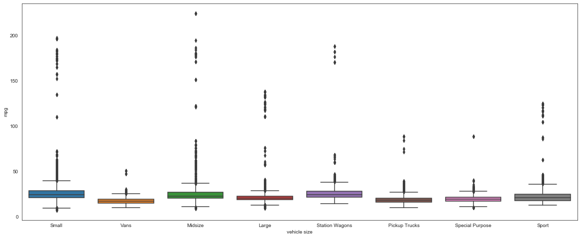
MPG in different vehicle class sizes doesn’t seem to differ much. But when separated into electric or not, the difference is clear.
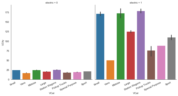
# Create column subplots based on drive category
g=sns.catplot(x='VCat',y='UCity', data=df, kind="bar", col="electric")
g.set_xticklabels(rotation=25, horizontalalignment='right')
plt.show()
MAKE
df['make'].value_counts(normalize=True)[:10]
    Chevrolet        0.098955
    Ford             0.082000
    Dodge            0.063680
    GMC              0.063423
    Toyota           0.050481
    BMW              0.047316
    Mercedes-Benz    0.036459
    Nissan           0.035146
    Volkswagen       0.028199
    Mitsubishi       0.026373
    Name: make, dtype: float64
df.groupby('make')['UCity'].mean().sort_values(ascending=False)
    make
    Tesla                                 127.505172
    CODA Automotive                       110.300000
    BYD                                    95.778233
    smart                                  92.472678
    Azure Dynamics                         88.400000
                                             ...
    Superior Coaches Div E.p. Dutton       12.000000
    Laforza Automobile Inc                 12.000000
    S and S Coach Company  E.p. Dutton     11.000000
    Bugatti                                 9.866667
    Vector                                  8.722225
    Name: UCity, Length: 133, dtype: float64
Tesla is the most fuel efficient maker of car by far.
MODEL
There are almost 4000 unique models: too many understand. Won’t include in the feature set. But looking at the average mpg for unique combinations of make AND model reveals other superheroes and losers.
df['model'].value_counts()
    F150 Pickup 2WD                215
    F150 Pickup 4WD                193
    Truck 2WD                      187
    Mustang                        180
    Jetta                          175
                                  ...
    Q40                              1
    Ram 1500 Pickup 4WD FFV          1
    Roadster                         1
    Sport Van G30 2WD (cargo)        1
    F150 5.0L 2WD GVWR>7599 LBS      1
    Name: model, Length: 3913, dtype: int64
df.groupby(['make','model'])['UCity'].mean().sort_values(ascending=False)
    make         model
    Hyundai      Ioniq Electric                   224.8000
    Scion        iQ EV                            197.5771
    BMW          i3 BEV                           196.4000
                 i3 BEV (60  Amp-hour battery)    196.4000
    Tesla        Model 3 Long Range               190.8500
                                                    ...
    Rolls-Royce  Corniche/Continental               9.0000
    Ferrari      Ferrari F50                        8.8889
                 Enzo Ferrari                       8.4473
    Vector       W8                                 8.0000
    Lamborghini  Countach                           7.0000
    Name: UCity, Length: 3981, dtype: float64
# drop model as there would be too many dummy variables
df.drop(['model'], axis='columns', inplace=True)
# the presence of the mpg data might be an indicator of mindful fuel consumption
print(df['mpgData'].value_counts(normalize=True))
df = pd.get_dummies(df, columns=['mpgData'], drop_first=True)
    N    0.673365
    Y    0.326635
    Name: mpgData, dtype: float64
# no clear differences in fuel consumption
df.groupby('mpgData_Y')['UCity'].mean().sort_values(ascending=False)
    mpgData_Y
    1    24.023323
    0    22.393587
    Name: UCity, dtype: float64
# this feature is unbalanced and more of an edge case scenario so will drop
# print(df['phevBlended'].value_counts(normalize=True))
print(df['phevBlended'].value_counts())
df.drop(['phevBlended'], axis='columns', inplace=True)

    False    38790
    True        76
    Name: phevBlended, dtype: int64
Conclusion of the categorical EDA: we ended up with 4 neat understandble features: drive, fuel type, make, size. The biggest discovery of this section is presence of the electric vehicles, which are an entirely separate group of vehicles in terms of fuel efficiency.
2.b. Numeric
There are 63 numeric features. Most of those will be dropped as missing, the rest will fist be examined for it’s distribution, and then its relation with y.
num_df = df.select_dtypes(include=[np.number])
# num_df.info()
# there are no numeric columns with more than a half of missing values
(num_df.isnull().sum()/len(num_df)*100).sort_values(ascending=False)[:5]

    cylinders    0.419390
    displ        0.414244
    mpgData_Y    0.000000
    comb08       0.000000
    ghgScore     0.000000
    dtype: float64
The two missing features, cylinders and engine displacement, have to do with whether the vehicle type is electric or not, so will probably have to be replaced.
(electric_df.isnull().sum()/len(electric_df)*100).sort_values(ascending=False)[:5]

    cylinders    100.000000
    displ         99.404762
    trany          5.357143
    drive          4.761905
    combA08U       0.000000
    dtype: float64
(nonelectric_df.isnull().sum()/len(nonelectric_df)*100).sort_values(ascending=False)[:5]

    drive        2.960790
    cylinders    0.007521
    displ        0.005014
    trany        0.005014
    combA08U     0.000000
    dtype: float64
num_df.corr()['UCity'].sort_values()

    co2TailpipeGpm   -0.723749
    displ            -0.713656
    barrels08        -0.712833
    cylinders        -0.680882
    fuelCost08       -0.655781
                        ...
    highway08         0.925799
    comb08            0.984401
    city08            0.997739
    UCity             1.000000
    charge120              NaN
    Name: UCity, Length: 62, dtype: float64
# looking at uniuque values per numerical features
num_df.nunique().sort_values(ascending=False)\
        .rename('Count').to_frame()
| Count | |
|---|---|
| id | 38866 |
| UHighway | 7409 |
| UCity | 7177 |
| comb08U | 5262 |
| highway08U | 3863 |
| ... | ... |
| charge240b | 8 |
| transmission | 2 |
| electric | 2 |
| mpgData_Y | 2 |
| charge120 | 1 |
62 rows × 1 columns
Since the task is to predict UCity, which is the “unadjusted city MPG for fuelType1”, we’ll drop features related to fuelType2. We are also going to drop confounding features related to city and highway mpg consumption, as well as features that are the consequence and not the cause of MPGm such as ‘youSaveSpend’.
fueltype2_related=['barrelsA08','cityA08','cityA08U','co2A',
                   'co2TailpipeAGpm','combA08', 'combA08U',
                   'fuelCostA08','ghgScoreA','highwayA08','highwayA08U',
                   'rangeCityA', 'rangeHwyA', 'UCityA', 'UHighwayA']
confounding=['city08','city08U','comb08','comb08U','highway08',
             'highway08U','UHighway', 'phevHwy', 'phevComb', 'phevCity']
secondary=['id']
phev=['cityUF', 'combinedUF', 'highwayUF', 'charge240b', 'charge240',
      'combE','combinedCD','combinedUF','highwayUF']
mono_value=['charge120', 'range','rangeCity']
few_data=['cityCD', 'cityE','cityUF','highwayCD', 'highwayE', 'rangeHwy', ]
# redundant=['city08','city08U','cityA08','cityA08U','cityCD','cityE','cityUF']

size = ['hlv', 'hpv', 'lv2', 'lv4', 'pv2', 'pv4'] # size varibles have most values 0
scores=['feScore', 'ghgScore']
costs=['fuelCost08', 'youSaveSpend']

# drop the chosen columns
df.drop(fueltype2_related, axis='columns', inplace=True)
df.drop(confounding, axis='columns', inplace=True)
df.drop(secondary, axis='columns', inplace=True)
df.drop(mono_value, axis='columns', inplace=True)
df.drop(few_data, axis='columns', inplace=True)
# df.drop(redundant, axis='columns', inplace=True)
df.drop(size, axis='columns', inplace=True)
df.drop(scores, axis='columns', inplace=True)
df.drop(costs, axis='columns', inplace=True)
# df.drop(phev, axis='columns', inplace=True)
df['engId'].value_counts()

    0        12566
    1          158
    2          141
    3          124
    5          124
             ...
    1881         1
    30583        1
    4231         1
    492          1
    3243         1
    Name: engId, Length: 2510, dtype: int64
# i don't understand engId feature and I have a feeling it won't be useful
df.drop('engId', axis='columns', inplace=True)

# co2 values are awkward and it has exact same description in Data Description
df.drop('co2', axis='columns', inplace=True)
Visualize distribution of the the most interesting numeric features
First, look at it’s distribution, and then at its relation with mpg.
ENGINE DISPLACEMENT in liters
In this section we will learn that this feature is only relevant when regressing the non-electric vehicles.
df['displ'].value_counts()

    2.0    3933
    3.0    3184
    2.5    2427
    2.4    1971
    3.5    1637
           ...
    1.1       8
    0.9       6
    0.6       5
    7.4       4
    0.0       1
   Name: displ, Length: 66, dtype: int64
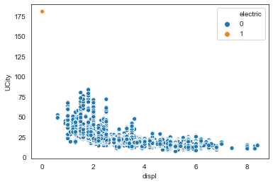
So there is one observation that has 0 litres of engine displacement and it turns out it’s a single electric vehicle that doesn’t have NaN instead.
sns.scatterplot(x="displ", y="UCity", data=df, hue="electric")
plt.show()
# drop the nonelectric rows with missing 'displ'
df = df.drop(df.loc[(df['electric']==0) & (df['displ'].isnull())].index)

# replace electric rows with missing 'displ' with 0
df['displ'].loc[df['electric']==1] = df['displ'].fillna(0.0)

plt.hist(df['displ'], bins=20);
from scipy.stats import linregress
# Compute the linear regression
res = linregress(df['displ'], df['UCity'])
print(res)

    LinregressResult(slope=-4.335493255200686, intercept=37.25543851518689, rvalue=-0.567240305135929, pvalue=0.0, stderr=0.031930083788337324)
The slope tells me that per one liter of engine displacement increases, we lose 3.5 mpg efficiency. And the intercept tells us that when there is zero liters engine displacement, the vehicle uses 34 mpg.
sns.lmplot(x='displ', y='UCity', data=df, hue='electric',
           line_kws={'color':'orange'}, scatter_kws={'alpha': 0.1})
plt.show()
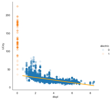
Straight line is clearly not the best fit. Compare it with higher polynomials:
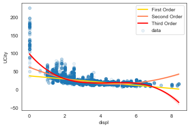
# Generate a scatter plot of the variables
plt.scatter(df['displ'], df['UCity'], label='data', marker='o', alpha=0.1)

# Plot a linear regression of order 1
sns.regplot(x='displ', y='UCity', data=df, scatter=None, color='gold', label='First Order')
# Plot a linear regression of order 2
sns.regplot(x='displ', y='UCity', data=df, scatter=None, order=2, color='coral', label='Second Order')
# Plot a linear regression of order 3
sns.regplot(x='displ', y='UCity', data=df, scatter=None, order=3, color='red', label='Third Order')
# order 4 was too much
# sns.regplot(x='displ', y='UCity', data=df, scatter=None, order=4, color='hotpink', label='Fourth Order')

# Add a legend and display the plot
plt.legend(loc='upper right')
plt.show()
CYLINDERS
Cylinders feature is also only relevant when regressing the non-electric vehicles, as this section will show.
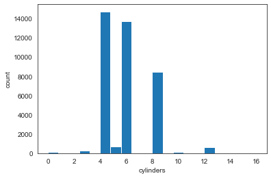
df['cylinders'].value_counts()
# df['cylinders']=df['cylinders'].astype(int)

    4.0     14722
    6.0     13694
    8.0      8458
    5.0       730
    12.0      605
    3.0       274
    10.0      161
    2.0        50
    16.0        9
    Name: cylinders, dtype: int64
# look at the nonelectric rows with missing 'cylinders'
df.loc[(df['electric']==0) & (df['cylinders'].isnull())]

# drop the single nonelectric row with missing 'cylinders'
df = df.drop(df.loc[(df['electric']==0) & (df['cylinders'].isnull())].index)

# replace electric rows with missing 'cylinders' with 0
df['cylinders'].loc[df['electric']==1] = df['cylinders'].fillna(0.0)

plt.hist(df['cylinders'], bins=20);
plt.xlabel('cylinders')
plt.ylabel('count')
plt.show()
# Generate a scatter plot of the variables
plt.scatter(df['cylinders'], df['UCity'], label='data', marker='o', alpha=0.1)

# Plot a linear regression of order 1
sns.regplot(x='cylinders', y='UCity', data=df, scatter=None, color='gold', label='First Order')
# Plot a linear regression of order 2
sns.regplot(x='cylinders', y='UCity', data=df, scatter=None, order=2, color='coral', label='Second Order')
# Plot a linear regression of order 3
sns.regplot(x='cylinders', y='UCity', data=df, scatter=None, order=3, color='red', label='Third Order')
# order 4 was too much
# sns.regplot(x='displ', y='UCity', data=df, scatter=None, order=4, color='hotpink', label='Fourth Order')

# Add a legend and display the plot
plt.legend(loc='upper right')
plt.show()
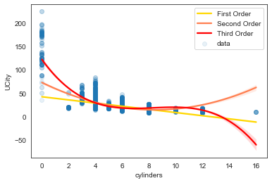
Negative correlation between the number of cylinders and fuel efficiency is expected, as a cylinder is where the gasoline is burned and turned into power. Specifically, as the number of cylinders increases, fuel efficiency falls, by 2.6 MPG. So an engine with fewer cylinders gets better fuel economy. Interpreting the intercept doesn’t make much sense here as we know that cars can’t run on zero cylinders.
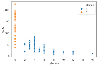
sns.scatterplot(x="cylinders", y="UCity", data=df, hue="electric") #, hue_order=["Rural", "Urban"]
plt.show()
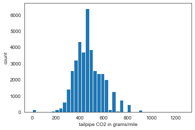
TAILPIPE CO2 in grams/mile
plt.hist(df['co2TailpipeGpm'], bins=40);
plt.xlabel('tailpipe CO2 in grams/mile')
plt.ylabel('count')
plt.show()
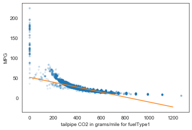
# Plot the illiteracy rate versus fertility
_ = plt.plot(df['co2TailpipeGpm'], df['UCity'], marker='.', linestyle='none', alpha=0.1)
# plt.margins(0.02)
_ = plt.xlabel('tailpipe CO2 in grams/mile for fuelType1')
_ = plt.ylabel('MPG')

# Perform a linear regression using np.polyfit(): a, b
a, b = np.polyfit(df['co2TailpipeGpm'], df['UCity'], 1)

# Print the results to the screen
print('slope =', a, 'tailpipe CO2 / MPG')
print('intercept =', b, 'tailpipe CO2')
# Make theoretical line to plot
x = np.array([0,1200])
y = a * x + b
# Add regression line to your plot
_ = plt.plot(x, y)
# Draw the plot
plt.show()
    slope = -0.061855382918203236 tailpipe CO2 / MPG
    intercept = 51.96491725434999 tailpipe CO2
# Generate a scatter plot of the variables
plt.scatter(df['co2TailpipeGpm'], df['UCity'], label='data', marker='o', alpha=0.1)

# Plot a linear regression of order 1
sns.regplot(x='co2TailpipeGpm', y='UCity', data=df,scatter=None, color='gold', label='First Order')
# Plot a linear regression of order 2
sns.regplot(x='co2TailpipeGpm', y='UCity', data=df, scatter=None, order=2, color='coral', label='Second Order')
# Plot a linear regression of order 3
sns.regplot(x='co2TailpipeGpm', y='UCity', data=df, scatter=None, order=3, color='red', label='Third Order')
# order 4 was too much
# sns.regplot(x='displ', y='UCity', data=df, scatter=None, order=4, color='hotpink', label='Fourth Order')

# Add a legend and display the plot
plt.legend(loc='upper right')
plt.show()
2.c. How has fuel economy changed over time?
df['year'] = pd.to_datetime(df['year'], format='%Y')
mpg_by_year = df.groupby('year')['UCity'].mean()

# Plot a line chart
ax = mpg_by_year.plot(figsize=(10, 5), linewidth=2, fontsize=6)
ax.set_title('Average annual MPG', fontsize=14)
plt.xlabel('year', fontsize=12)
plt.ylabel('MPG', fontsize=12)
ax.tick_params(axis='x', labelsize= 10)
ax.tick_params(axis='y', labelsize= 10)

# Add a red vertical line
ax.axvline('2007', color='red', linestyle='--')
plt.show()
The trend of this time-series is pretty straightforward: fuel economy has really became prominent after 2007, around the time plug-in electric cars such as Tesla Roadster and Nissan Leaf became available for retail customer. Visually, there isn’t much nuance to the plot, such as seasonality or noise, other than two downward runs, 1985-1995 and 1996-1007.
Let’s see how the same trend looks when plotted for electric and diesel vehicles separately.
fig, ax = plt.subplots(figsize=(10, 5))
ax.plot(electric_df.groupby('year')['UCity'].mean(), color='blue', label='electric')
ax.plot(nonelectric_df.groupby('year')['UCity'].mean(), color='red', label='non-electric')
ax.set_ylabel('average mpg')
plt.legend()
plt.show()
Plotting the electric and nonelectric vehicles separately is quite telling:
- there is a world of difference between the two types
- the non-electric cars have barely experienced change in mpg, while the electric cars have seen a considerable rise in fuel efficiency.
- the rise in the electric vehicle’s mpg started around 1998, when the first hybrid cars came out.
avg_mpg_2019=df[['year', 'UCity']].loc[df['year']==2019]['UCity'].mean() #26.49
max_mpg_2019=df[['year', 'UCity']].loc[df['year']==2019]['UCity'].max() #79.99
avg_mpg_1984=df[['year', 'UCity']].loc[df['year']==1984]['UCity'].mean() #22.61
max_mpg_1984=df[['year', 'UCity']].loc[df['year']==1984]['UCity'].max() #51.0

electric_df['year'].min() #1998
Modeling
EDA helped us identify what car features signify an electric vehicle: no cylinders, no engine, no manual transmission, some types of drive absent. Running statsmodels’ logistic regression with these features confirmed this with its “Perfect Separation” error, which happens when all or nearly all of the values in the predictor categories are associated with only one of the binary outcome values. So it’s clear that fuel efficiciency should be modelled differently for electric and diesel cars. The intuition is that a regression can predict mpg more accurately for the 2 groups separately.
What type of regression? We’ve seen that the relationship between numeric variables and MPG is non-linear. A simple regression can’t measure non-linear relationships (the estimated slope is small). To describe a non-linear relationship, one option is to add a new variable that is either a quadratic term or a non-linear combination of other variables.
As this is supposed to be a sketch model various further improvements could be explored. Let’s now look at how MPG differs between the two type of cars.
plt.subplots(figsize=(10,5))
sns.distplot(electric_df['UCity'], label='electric')
sns.distplot(nonelectric_df['UCity'], label='nonelectric')
plt.title('KDE of fuel efficiency')
plt.legend()
sns.despine()
plt.show()
electric_df = df.loc[df['fuelType']=='Electricity']
nonelectric_df = df.loc[df['fuelType']!='Electricity']

# df_train = df.sample(int(df.shape[0]*0.66), random_state = 1)
# df_test = df[~df.isin(df_train)].dropna(how = 'all')

electric_train = electric_df.sample(int(electric_df.shape[0]*0.66), random_state = 2)
electric_test = electric_df[~electric_df.isin(electric_train)].dropna(how = 'all')
nonelectric_train = nonelectric_df.sample(int(nonelectric_df.shape[0]*0.66), random_state = 1)
nonelectric_test =nonelectric_df[~nonelectric_df.isin(nonelectric_train)].dropna(how = 'all')

print('FULL')
print('all observations: ', df.shape[0])
print('2/3 observations: ', int(df.shape[0]*0.66))
print('train: ', df_train.shape)
print('test: ', df_test.shape, '\n')

print('ELECTRIC')
print('all observations: ', electric_df.shape[0])
print('2/3 observations: ', int(electric_df.shape[0]*0.66))
print('train: ', electric_train.shape)
print('test: ', electric_test.shape, '\n')

print('NON ELECTRIC')
print('all observations: ', nonelectric_df.shape[0])
print('2/3 observations: ', int(nonelectric_df.shape[0]*0.66))
print('train: ', nonelectric_train.shape)
print('test: ', nonelectric_test.shape)

    FULL
    all observations:  38866
    2/3 observations:  25651
    train:  (25651, 22)
    test:  (13215, 22)

    ELECTRIC
    all observations:  160
    2/3 observations:  105
    train:  (105, 22)
    test:  (55, 22)

    NON ELECTRIC
    all observations:  38706
    2/3 observations:  25545
    train:  (25545, 22)
    test:  (13161, 22)
# modeling packages used
import statsmodels.formula.api as smf
import statsmodels.api as sm
from statsmodels.formula.api import ols, glm

cat_df = df.select_dtypes(exclude=[np.number])
print(cat_df.columns)
cat_dummies = pd.get_dummies(cat_df, drop_first=True)
df_dummies = pd.get_dummies(cat_df, columns=cat_df.columns, drop_first=True)

num_df = df.select_dtypes(include=[np.number])
print(num_df.columns)
# df['year']=df['year'].dt.year
# num_df = df.select_dtypes(include=[np.number]).drop(['barrels08','co2TailpipeGpm','UCity', 'electric', 'mpg','mpg_level_int'], axis=1)
    Index(['drive', 'fuelType', 'make', 'year', 'VCat'], dtype='object')
    Index(['barrels08', 'co2TailpipeGpm', 'cylinders', 'displ', 'UCity', 'mpg',
           'electric', 'transmission', 'mpgData_Y', 'electric_2'],
          dtype='object')
# when trying to fit logistic, i got an error "Perfect separation detected, results not available"
print(pd.crosstab(df['electric'], df['displ'].astype(int)), '\n'*2)
print(pd.crosstab(df['electric'], df['cylinders'].astype(int)), '\n'*2)
print(pd.crosstab(df['electric'], df['transmission']), '\n'*2)
print(pd.crosstab(df['electric'], df['mpgData_Y']), '\n'*2)
print(pd.crosstab(df['electric'], df['VCat']), '\n'*2)
# print(pd.crosstab(df['electric'], df['drive']), '\n'*2)
print(df.groupby('electric')['co2TailpipeGpm'].mean(), '\n'*2)
print(df.groupby('electric')['barrels08'].mean())
# LOGISTIC
# formula = 'electric ~ barrels08 + mpgData_Y'
formula = 'electric ~ drive + VCat + barrels08 + transmission + mpgData_Y'
model_glm_binomial = glm(formula = formula, data = df_train, family = sm.families.Binomial()).fit()
# print("model coefficients:", model_glm_binomial.summary())

# Compute the multiplicative effect on the odds
print(' Odds:\n', (np.exp(model_glm_binomial.params).sort_values()))

     Odds:
     drive[T.4-Wheel or All-Wheel Drive]    2.518779e-14
    drive[T.Part-time 4-Wheel Drive]       7.879067e-11
    drive[T.Front-Wheel Drive]             1.870369e-09
    drive[T.Rear-Wheel Drive]              6.523411e-09
    drive[T.All-Wheel Drive]               3.177813e-07
    drive[T.4-Wheel Drive]                 1.548961e-06
    VCat[T.Pickup Trucks]                  4.073434e-05
    VCat[T.Vans]                           8.349858e-02
    VCat[T.Special Purpose]                1.133455e-01
    barrels08                              1.203549e-01
    mpgData_Y                              7.059830e-01
    VCat[T.Small]                          3.056153e+00
    VCat[T.Midsize]                        3.471127e+01
    VCat[T.Sport]                          2.303680e+02
    VCat[T.Station Wagons]                 1.507328e+03
    Intercept                              2.044173e+03
    transmission                           2.995781e+05
    dtype: float64
Not surprisingly the the presence ‘4-Wheel or All-Wheel Drive’ and ‘Part-time 4-Wheel Drive’ are the strongest features: the electric cars don’t have these types of drives. Taking the first numeric variable, barrels08, the estimated odds of car being electric multiply by 0.12 (the real number of the exponentiated coefficient in scientific notation form above) for 1 barrel decrease in annual petroleum consumption.
# Extract and print confidence intervals
print(model_glm_binomial.conf_int())
                                                0              1
    Intercept                            -32849.667712   32864.913209
    drive[T.4-Wheel Drive]                  -90.993970      64.238118
    drive[T.4-Wheel or All-Wheel Drive]  -49692.666618   49630.041785
    drive[T.All-Wheel Drive]                -85.283598      55.359793
    drive[T.Front-Wheel Drive]              -90.684843      50.490583
    drive[T.Part-time 4-Wheel Drive]    -236110.172023  236063.643570
    drive[T.Rear-Wheel Drive]               -89.400636      51.704899
    VCat[T.Midsize]                           0.175340       6.918789
    VCat[T.Pickup Trucks]                   -79.977109      59.760231
    VCat[T.Small]                            -0.525033       2.759347
    VCat[T.Special Purpose]                  -4.630524       0.275894
    VCat[T.Sport]                            -2.014355      12.893712
    VCat[T.Station Wagons]                  -16.785405      31.421593
    VCat[T.Vans]                             -4.868986      -0.096866
    barrels08                                -3.270308      -0.964312
    transmission                         -32844.730973   32869.951234
    mpgData_Y                                -1.660836       0.964507
Our model is more confident in some features than others.
# further examine the estimated probabilities (the output)
# Compute estimated probabilities for GLM model
prediction = model_glm_binomial.predict(exog = df_test)
# Add prediction to the existing data frame and assign column name prediction
df_test['prediction'] = prediction
# Examine the computed predictions
print(df_test[['electric', 'prediction']])

         electric    prediction
    9           0.0  1.859487e-12
    14          0.0  1.616957e-24
    15          0.0  7.760125e-19
    18          0.0  3.134765e-15
    20          0.0  1.581086e-17
    ...         ...           ...
    40069       0.0  5.080335e-17
    40070       0.0  1.844272e-26
    40073       0.0  5.810935e-13
    40077       0.0  7.760125e-19
    40079       0.0  4.101115e-25
    [13215 rows x 2 columns]
The predicted values are within the (0,1) range as is required by the binary response variable. The probability that the examined vehicles are electric are very very small, which is reasonable.
# Define the cutoff
cutoff = 0.5
# Compute class predictions: y_prediction
y_prediction = np.where(prediction > cutoff, 1, 0)
# Compute class predictions y_pred
y_prediction = np.where(prediction > cutoff, 1, 0)
# Assign actual class labels from the test sample to y_actual
y_actual = df_test['electric']
# Compute the confusion matrix using crosstab function
conf_mat = pd.crosstab(y_actual, y_prediction, rownames=['Actual'], colnames=['Predicted'], margins = True)
# Print the confusion matrix
print(conf_mat)

    Predicted      0   1    All
    Actual
    0.0        13137  15  13152
    1.0            1  62     63
    All        13138  77  13215
Considering the target is highly imbalanced, the prediction did good: it correctly predicted all but one of the electric vehicles as such.
Regression on electric and nonelectric separately
Gamma Regression models a gamma distributed, strictly positive variable of interest. They tend to cluster toward the lower range of the observed values, but in a small minority of cases take on large values. Target variables of this nature represent a data generation process that is not consistent with the Normality assumptions underlying the traditional linear regression model. The values of the target variable will not always be integer numbers either, so neither do they follow a Poisson distribution or Negative Binomial distribution based process. They can be estimated using methods similar to linear regression, via the generalized linear model framework.
The core concept of any GLM is: Keep the weighted sum of the features, but allow non- Gaussian outcome distributions and connect the expected mean of this distribution and the weighted sum through a possibly nonlinear function
GAMMA on NONELECTRIC
# not included: 'make'

formula = 'UCity ~ drive + VCat + year + displ + cylinders + co2TailpipeGpm + barrels08 + transmission + mpgData_Y'
model_gamma_link = glm(formula = formula, data = nonelectric_train,
                family = sm.families.Gamma(link=sm.families.links.log())).fit()
print(model_gamma_link.summary())

                     Generalized Linear Model Regression Results
    ==============================================================================
    Dep. Variable:                  UCity   No. Observations:                25543
    Model:                            GLM   Df Residuals:                    25488
    Model Family:                   Gamma   Df Model:                           54
    Link Function:                    log   Scale:                       0.0066081
    Method:                          IRLS   Log-Likelihood:                -49049.
    Date:                Wed, 11 Nov 2020   Deviance:                       148.33
    Time:                        12:31:20   Pearson chi2:                     168.
    No. Iterations:                    15
    Covariance Type:            nonrobust
    ============================================================================================================
                                                   coef    std err          z      P>|z|      [0.025      0.975]
    ------------------------------------------------------------------------------------------------------------
    Intercept                                    4.0998      0.006    669.687      0.000       4.088       4.112
    drive[T.4-Wheel Drive]                      -0.0513      0.008     -6.725      0.000      -0.066      -0.036
    drive[T.4-Wheel or All-Wheel Drive]         -0.0114      0.007     -1.653      0.098      -0.025       0.002
    drive[T.All-Wheel Drive]                    -0.0507      0.007     -6.860      0.000      -0.065      -0.036
    drive[T.Front-Wheel Drive]                   0.0019      0.007      0.270      0.787      -0.012       0.016
    drive[T.Part-time 4-Wheel Drive]            -0.0679      0.010     -6.854      0.000      -0.087      -0.048
    drive[T.Rear-Wheel Drive]                   -0.0327      0.007     -4.639      0.000      -0.046      -0.019
    VCat[T.Midsize]                              0.0263      0.003      9.502      0.000       0.021       0.032
    VCat[T.Pickup Trucks]                        0.0644      0.003     22.304      0.000       0.059       0.070
    VCat[T.Small]                                0.0393      0.003     15.480      0.000       0.034       0.044
    VCat[T.Special Purpose]                      0.0531      0.003     15.781      0.000       0.046       0.060
    VCat[T.Sport]                                0.0436      0.003     15.711      0.000       0.038       0.049
    VCat[T.Station Wagons]                       0.0330      0.003     10.535      0.000       0.027       0.039
    VCat[T.Vans]                                 0.0629      0.003     19.148      0.000       0.056       0.069
    year[T.Timestamp('1985-01-01 00:00:00')]    -0.0036      0.006     -0.591      0.554      -0.016       0.008
    year[T.Timestamp('1986-01-01 00:00:00')]    -0.0127      0.006     -2.006      0.045      -0.025      -0.000
    year[T.Timestamp('1987-01-01 00:00:00')]    -0.0170      0.006     -2.701      0.007      -0.029      -0.005
    year[T.Timestamp('1988-01-01 00:00:00')]    -0.0263      0.006     -4.148      0.000      -0.039      -0.014
    year[T.Timestamp('1989-01-01 00:00:00')]    -0.0255      0.006     -3.980      0.000      -0.038      -0.013
    year[T.Timestamp('1990-01-01 00:00:00')]    -0.0361      0.006     -5.642      0.000      -0.049      -0.024
    year[T.Timestamp('1991-01-01 00:00:00')]    -0.0340      0.006     -5.341      0.000      -0.046      -0.022
    year[T.Timestamp('1992-01-01 00:00:00')]    -0.0423      0.006     -6.665      0.000      -0.055      -0.030
    year[T.Timestamp('1993-01-01 00:00:00')]    -0.0484      0.006     -7.601      0.000      -0.061      -0.036
    year[T.Timestamp('1994-01-01 00:00:00')]    -0.0480      0.006     -7.418      0.000      -0.061      -0.035
    year[T.Timestamp('1995-01-01 00:00:00')]    -0.0506      0.006     -7.825      0.000      -0.063      -0.038
    year[T.Timestamp('1996-01-01 00:00:00')]    -0.0587      0.007     -8.780      0.000      -0.072      -0.046
    year[T.Timestamp('1997-01-01 00:00:00')]    -0.0576      0.007     -8.592      0.000      -0.071      -0.044
    year[T.Timestamp('1998-01-01 00:00:00')]    -0.0632      0.007     -9.533      0.000      -0.076      -0.050
    year[T.Timestamp('1999-01-01 00:00:00')]    -0.0624      0.007     -9.433      0.000      -0.075      -0.049
    year[T.Timestamp('2000-01-01 00:00:00')]    -0.0642      0.007     -9.595      0.000      -0.077      -0.051
    year[T.Timestamp('2001-01-01 00:00:00')]    -0.0608      0.007     -9.092      0.000      -0.074      -0.048
    year[T.Timestamp('2002-01-01 00:00:00')]    -0.0608      0.007     -9.322      0.000      -0.074      -0.048
    year[T.Timestamp('2003-01-01 00:00:00')]    -0.0566      0.007     -8.702      0.000      -0.069      -0.044
    year[T.Timestamp('2004-01-01 00:00:00')]    -0.0612      0.006     -9.462      0.000      -0.074      -0.048
    year[T.Timestamp('2005-01-01 00:00:00')]    -0.0629      0.006     -9.829      0.000      -0.075      -0.050
    year[T.Timestamp('2006-01-01 00:00:00')]    -0.0636      0.006     -9.911      0.000      -0.076      -0.051
    year[T.Timestamp('2007-01-01 00:00:00')]    -0.0686      0.006    -10.651      0.000      -0.081      -0.056
    year[T.Timestamp('2008-01-01 00:00:00')]    -0.0622      0.006     -9.701      0.000      -0.075      -0.050
    year[T.Timestamp('2009-01-01 00:00:00')]    -0.0565      0.006     -8.804      0.000      -0.069      -0.044
    year[T.Timestamp('2010-01-01 00:00:00')]    -0.0393      0.007     -6.025      0.000      -0.052      -0.027
    year[T.Timestamp('2011-01-01 00:00:00')]    -0.0297      0.007     -4.557      0.000      -0.042      -0.017
    year[T.Timestamp('2012-01-01 00:00:00')]    -0.0212      0.007     -3.246      0.001      -0.034      -0.008
    year[T.Timestamp('2013-01-01 00:00:00')]    -0.0172      0.007     -2.643      0.008      -0.030      -0.004
    year[T.Timestamp('2014-01-01 00:00:00')]    -0.0109      0.006     -1.687      0.092      -0.024       0.002
    year[T.Timestamp('2015-01-01 00:00:00')]    -0.0064      0.006     -0.990      0.322      -0.019       0.006
    year[T.Timestamp('2016-01-01 00:00:00')]    -0.0067      0.006     -1.032      0.302      -0.019       0.006
    year[T.Timestamp('2017-01-01 00:00:00')]     0.0012      0.007      0.189      0.850      -0.012       0.014
    year[T.Timestamp('2018-01-01 00:00:00')]     0.0084      0.006      1.295      0.195      -0.004       0.021
    year[T.Timestamp('2019-01-01 00:00:00')]     0.0023      0.007      0.312      0.755      -0.012       0.017
    displ                                       -0.0013      0.001     -1.213      0.225      -0.003       0.001
    cylinders                                   -0.0079      0.001    -10.496      0.000      -0.009      -0.006
    co2TailpipeGpm                              -0.0024    3.3e-05    -73.854      0.000      -0.003      -0.002
    barrels08                                    0.0103      0.001     12.125      0.000       0.009       0.012
    transmission                                -0.0006      0.001     -0.467      0.640      -0.003       0.002
    mpgData_Y                                    0.0142      0.001     11.526      0.000       0.012       0.017
    ============================================================================================================
# further examine the estimated probabilities (the output)
# Compute estimated probabilities for GLM model
pred_gamma_link = model_gamma_link.predict(nonelectric_test)

# Create dataframe of predictions for linear and GLM model: predictions
predictions = pd.DataFrame({'Pred_gamma_link': pred_gamma_link})
# Concatenate test sample and predictions and view the results
data_gamma_link = pd.concat([nonelectric_test['UCity'], predictions], axis = 1)
print(data_gamma_link.head())

          UCity  Pred_gamma_link
    9   29.0000        28.276294
    10  30.0000        29.098004
    14  14.4444        14.178255
    15  25.0000        26.171768
    18  21.0000        21.787792
coefs = model_gamma_link.params.reindex(model_gamma_link.params.abs().sort_values(ascending = False).index)
print(" strongest", "\n",coefs[:5], "\n")
print(" weakest", "\n",coefs[-5:])

     strongest
     Intercept                                   4.099825
    year[T.Timestamp('2007-01-01 00:00:00')]   -0.068609
    drive[T.Part-time 4-Wheel Drive]           -0.067892
    VCat[T.Pickup Trucks]                       0.064403
    year[T.Timestamp('2000-01-01 00:00:00')]   -0.064158
    dtype: float64

     weakest
     year[T.Timestamp('2019-01-01 00:00:00')]    0.002318
    drive[T.Front-Wheel Drive]                  0.001920
    displ                                      -0.001285
    year[T.Timestamp('2017-01-01 00:00:00')]    0.001227
    transmission                               -0.000561
    dtype: float64
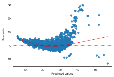
# seaborn residual plot
sns.residplot(pred_gamma_link[1::2], nonelectric_test['UCity'][1::2], lowess=True, line_kws={'color':'r', 'lw':1})
# sns.residplot(pred_glm_gamma_nolink[0::2], nonelectric_test['UCity'][0::2], lowess=True, line_kws={'color':'yellow', 'lw':1})
plt.xlabel('Predicted values')
sns.despine()
plt.ylabel('Residuals');
# Compare deviance of null and residual model
diff_deviance_gamma_link = model_gamma_link.null_deviance - model_gamma_link.deviance
# Print the computed difference in deviance
print(diff_deviance_gamma_link) # 1840: giant compared to the intercept

    1840.8866238914434
# SAME BUT NO LINK
model_gamma_nolink = glm(formula=formula, data=nonelectric_train,
                  family = sm.families.Gamma()).fit()
# print(model_glm_gamma_nolink.params, '\n')
# print(model_glm_gamma_nolink.summary(), '\n')

# further examine the estimated probabilities (the output)
# Compute estimated probabilities for GLM model
pred_gamma_nolink = model_gamma_nolink.predict(nonelectric_test)

# Create dataframe of predictions for linear and GLM model: predictions
pred_gamma_nolink_df = pd.DataFrame({'Pred_gamma_nolink': pred_gamma_nolink})
# Concatenate test sample and predictions and view the results
data_gamma_nolink = pd.concat([nonelectric_test['UCity'], pred_gamma_nolink_df], axis = 1)
print(data_gamma_nolink.head())

          UCity  Pred_gamma_nolink
    9   29.0000          28.285448
    10  30.0000          29.451960
    14  14.4444          14.442122
    15  25.0000          25.840262
    18  21.0000          21.001178
# Compare deviance of null and residual model
diff_deviance_gamma_nolink = model_glm_gamma_nolink.null_deviance - model_glm_gamma_nolink.deviance
# Print the computed difference in deviance
print(diff_deviance_gamma_nolink) # 1840: giant compared to the intercept

    1910.510697065141
all_pred = pd.concat([data_gamma_nolink, data_gamma_link['Pred_gamma_link']], axis = 1).sort_values(by='UCity')
all_pred
| UCity | Pred_gamma_nolink | Pred_gamma_link | |
|---|---|---|---|
| 34824 | 7.0000 | 7.636931 | 3.941159 |
| 36098 | 7.0000 | 7.626351 | 3.899682 |
| 39713 | 8.0000 | 8.797553 | 5.499091 |
| 34427 | 8.8889 | 8.923200 | 5.685065 |
| 12853 | 8.8889 | 8.897470 | 5.633712 |
| ... | ... | ... | ... |
| 30832 | 75.5931 | 56.534021 | 42.244441 |
| 32555 | 75.7000 | 61.670207 | 42.916034 |
| 31301 | 75.7000 | 60.955989 | 42.609199 |
| 32708 | 76.1014 | 57.559312 | 42.652465 |
| 31353 | 78.8197 | 122.623026 | 51.902314 |
13161 rows × 3 columns
GAMMA on ELECTRIC
formula = 'UCity ~ make + drive + VCat + year + co2TailpipeGpm + barrels08 + mpgData_Y'
model_el = glm(formula = formula, data = electric_df,
family = sm.families.Gamma(link=sm.families.links.log())).fit()
# print(model_el.summary())
# Compare deviance of null and residual model
diff_deviance_el = model_el.null_deviance - model_el.deviance
# Print the computed difference in deviance
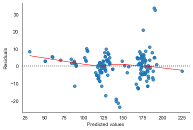
print(diff_deviance_el)
12.753214801323816
electric_df['transmission'].value_counts()

    1    160
    Name: transmission, dtype: int64
coefs_el = model_el.params.reindex(model_el.params.abs().sort_values(ascending = False).index)
print(" strongest", "\n",coefs_el[:5], "\n")
print(" weakest", "\n",coefs_el[-5:])

     strongest
     Intercept          4.961275
    barrels08         -2.335198
    make[T.Hyundai]    0.491656
    make[T.Scion]      0.432565
    make[T.Toyota]     0.365607
    dtype: float64

     weakest
     drive[T.Front-Wheel Drive]                 -0.028152
    VCat[T.Sport]                              -0.024332
    year[T.Timestamp('2012-01-01 00:00:00')]    0.020414
    mpgData_Y                                   0.018380
    co2TailpipeGpm                              0.000000
    dtype: float64
# Compute estimated probabilities for ELECTRIC model
pred_el = model_el.predict(electric_df)
# Create dataframe of predictions
pred_el_df = pd.DataFrame({'Pred_el': pred_el})
# Concatenate test sample and predictions and view the results
data_el = pd.concat([electric_test['UCity'], pred_el_df], axis = 1)
print(data_el.head())

            UCity     Pred_el
    7139      NaN  116.603437
    8143      NaN  118.543829
    8146      NaN   61.008032
    9212      NaN  126.536745
    9213  62.4074   61.572035
# seaborn residual plot
sns.residplot(pred_el, electric_df['UCity'], lowess=True, line_kws={'color':'r', 'lw':1})
# sns.residplot(pred_glm_gamma_nolink[0::2], nonelectric_test['UCity'][0::2], lowess=True, line_kws={'color':'yellow', 'lw':1})
plt.xlabel('Predicted values')
sns.despine()
plt.ylabel('Residuals');
model_el.fittedvalues

    7139     116.591931
    8143     118.534463
    8146      61.007940
    9212     126.528940
    9213      61.573192
                ...
    32935    174.030612
    33032    182.646913
    33409    224.800022
    33410    179.312803
    33411    179.312803
    Length: 160, dtype: float64
This is it for a sketch model. A quick look did not reveal any obvious problems (e.g. multicollinearity). The next stage would be to experiment with different levels of complexity to improve the model fit:
- try different combinations of the variables, i.e. wheather the inclusion of the variables improves the model fit.
- try different nonlinear, interaction terms.
- try different variable transformations.
These would be compared against a goodness-of-fit-metric such as deviance. However, it is important to keep in mind that while there are various ways to extend the simple model, most modifications of the linear model make the model less interpretable or less intuitive. Plus, if we violate the assumptions about the data generating process to gain better predictions, we might make the interpretation of the weights no longer valid.